 Skip to content
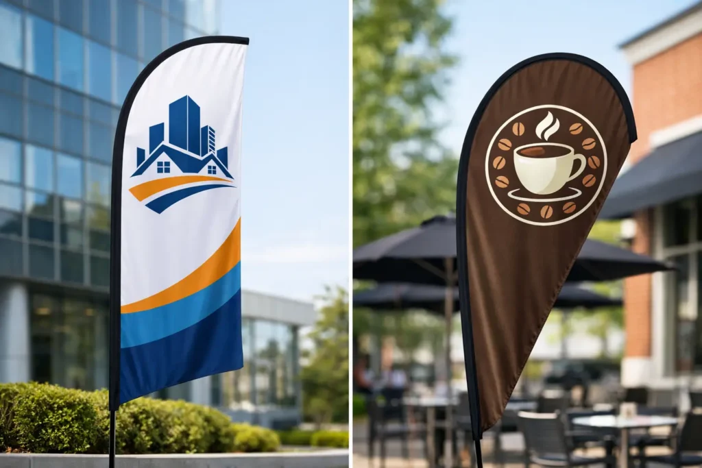
A busy parking lot gives you only a few seconds to earn attention. That is why choosing between feather flags versus teardrop flags is more than a style decision. The flag shape affects how your logo reads, how the display moves in the wind, where it fits, and what kind of message people notice first.
Both styles are strong choices for dealerships, retail stores, trade show booths, school events, fundraisers, golf outings, and community promotions. Both can be custom printed with your logo, colors, artwork, sale message, or directional copy. The right choice comes down to your design, location, and the job the flag needs to do.
Feather Flags Versus Teardrop Flags: The Main Difference
The easiest way to tell these two flag styles apart is their outline. A feather flag is tall and narrow, with a curved top that creates a long, flowing profile. A teardrop flag has a rounded outer edge and a taut, closed shape that resembles a drop of water.
That shape changes the feel of the display. Feather flags look active, tall, and highly visible from a distance. They are excellent when you want to create a row of branded displays, frame an entrance, or make a sales message stand out along a road. Teardrop flags look more compact and polished. Their tighter profile makes them a smart fit when artwork needs to remain easy to recognize in changing wind conditions.
Neither shape is automatically better. A feather flag usually gives you more vertical space for a large message. A teardrop flag gives you a more controlled presentation for a logo or simple graphic. Think about what a passerby needs to read and how far away they will be when they see it.
When Feather Flags Make the Stronger Statement
Feather flags are made for visibility. Their height and sweeping shape help them rise above vehicles, tables, crowds, and sidewalk traffic. For a dealership promotion, a set of feather flags can call out “SALE,” “SERVICE,” “OPEN,” or a financing message without requiring customers to search for the entrance.
They also work well for organizations that want a repeated visual message. A school can line a field entrance with mascot flags. A nonprofit can place sponsor flags around a fundraising walk. A retailer can use several flags along the edge of a parking area to create a clear visual path toward the store.
Best designs for feather flags
The long, narrow layout favors bold communication. Large type, a short callout, and high-contrast colors usually perform best. A vertical logo can work especially well, while a wide horizontal logo may need to be adjusted or stacked to use the available space effectively.
A feather flag is often the better choice when your message is the priority. If you need people to see “GRAND OPENING,” “NOW LEASING,” “TEAM PARKING,” or “VOTE HERE” from across a lot, its tall format earns its place.
Because feather flags have more movement, they can create energy at an outdoor activation. That motion is useful for drawing the eye, but it also means tiny details and fine copy are not a good fit. Let the flag do what it does best: deliver a bold message that is easy to catch at a glance.
When Teardrop Flags Are the Better Fit
Teardrop flags hold their shape more tightly, creating a clean display that remains recognizable even when the wind picks up. The fabric is tensioned around the curved frame, so the graphic area does not flutter as freely as a feather flag. For logo recognition, that can be a real advantage.
This makes teardrop flags a popular choice for corporate events, race sponsorships, golf tournaments, product demonstrations, and professional-looking outdoor displays. They are also useful where space is limited. Their rounded form has visual presence without feeling as tall or sprawling as a large feather flag.
Best designs for teardrop flags
A centered logo, bold icon, short phrase, or event mark is a natural match for a teardrop shape. If your organization has a distinctive emblem, mascot head, badge, or circular logo, a teardrop flag can give it a balanced presentation.
The closed silhouette also creates a consistent branded look in a group setting. Place teardrop flags near a registration tent, at a course tee box, beside a display table, or around an event entrance, and they bring color and identification without competing with every other sign nearby.
Teardrop flags can still carry promotional language, but keep it brief. A compact message like “CHECK IN,” “START,” “SPECIAL EVENT,” or “WELCOME” reads more cleanly than several lines of copy.
Compare Visibility, Wind, and Space Before You Order
A feather flag generally offers the greatest vertical reach. If your display needs to be seen above parked cars or from a busy street, the extra height can be a deciding factor. The shape is also effective for directional messaging because the eye naturally travels up and down the flag.
A teardrop flag has a slightly more contained footprint and a stable-looking profile. It can be the better option beside a booth, tent, sidewalk display, or entrance where you want branding to feel intentional rather than oversized. It is especially useful when the logo itself is the message.
Wind matters, but it should not be oversimplified. Both styles are designed for outdoor promotional use with the right pole and base setup. Feather flags visibly move more, which helps gain attention. Teardrop flags keep a more consistent shape, which helps preserve the appearance of graphics. For either style, choose a base that matches the installation surface and local conditions.
A ground spike works well for grass, soil, and many outdoor event areas. A cross base with a weight bag is a practical option for hard surfaces. Stronger wind, high-traffic locations, and larger flag sizes may call for additional weight and careful placement. A flag needs a secure foundation to look professional and perform as intended.
Printing and Artwork Can Change the Decision
The same logo will not look identical on every flag shape. Before production, consider whether your artwork is horizontal, vertical, square, or circular. That one detail can quickly point you toward the right display.
Feather flags are forgiving for vertical layouts and large text. Teardrop flags favor centered designs with strong shapes and a clear focal point. In either case, avoid treating the flag like a flyer. A flag is seen in motion and from a distance, so the message must be simpler than the artwork you would use on a brochure or web page.
Color choice matters too. Bright, contrasting colors can make a custom flag pop against pavement, grass, sky, and nearby signage. A dark logo on a dark background may look sharp on a computer screen but disappear outside. White space is not wasted space when it helps your brand mark stay readable.
If your file needs help, do not force a stretched or crowded design into a shape that does not suit it. A full-time design team can rebuild a logo, refine supplied artwork, or create a flag design around the message you need customers to see.
Choose Based on the Job, Not Just the Shape
Use feather flags when you need height, movement, repeated promotional language, or high visibility from a road or parking lot. They are a natural choice for retail promotions, dealerships, large outdoor events, and any setting where a bold message needs to stand above the activity.
Choose teardrop flags when you want a compact, taut display that gives your logo a clean presentation. They are especially effective for branded event zones, sponsorship activations, sports venues, registration areas, and displays where a polished logo-first look matters most.
For many organizations, the strongest answer is not one or the other. A matched set can do more work: feather flags on the perimeter to pull attention in, and teardrop flags at the booth, entrance, or registration point to reinforce the brand. Use one shape to attract and the other to identify.
Custom Flags are our specialty at Flags Made. Whether you have press-ready artwork or only a logo and an idea, the right flag begins with a clear purpose: get noticed, guide visitors, promote an offer, or give your event a branded finish. Choose the shape that serves that purpose, then make the design bold enough to be remembered.